Why Do We Need xG?
Author: Vibhor Agarwal

The 2015–16 season of the English Premier League was a huge anomaly. Leicester City defied odds of 5000-1 to win the premier league title, perhaps the single biggest upset in the history of sports. But, another almost unprecedented phenomenon occurred that season. Chelsea, who were the title holders from 2014–15 finished 10th. It is rare to see the title holder perform so poorly. At the halfway stage of the tournament, Chelsea languished at 14th on the table at just 20 points in 19 games. At that stage, a lot of pundits believed that Chelsea were simply unlucky and that they would improve on their performance. They did improve to 50 points and finished 10th. But was there any evidence to suggest that they would improve? Yes, there was.
Chelsea 2015/16
The evidence is called xG. By the grace of some good souls, xG is publicly available at https://understat.com/. We scraped the data through a Python query for this analysis. At the halfway stage of that season, Chelsea’s performance looked like this:

As you can see, Chelsea had a negative goal differential which is indicative of a below-average team. Incorporating their xG figures, this is how it looked:

Image 2 shows that Chelsea had underperformed their expected goal difference by 8.88 goals in 19 games. For those of you that may not be aware of xG, please read this explanation by Opta. In most cases, this would reflect bad luck and that regression towards xG should be expected. Taking historical outcomes for the xG difference on a match-by-match basis, understat suggests that Chelsea should have scored 28 points by then. This concrete evidence led the pundits to believe that a turnaround for Chelsea is imminent.
Does this hold true in general?
Yes, it does. For this, we look at data from the Big 5 European leagues from the previous four seasons, 2014–15 to 2017–18. We want to see whether expected points are a better indicator of future performance. We check correlations of two metrics with the points scored by a team in the second half of the season. The two metrics are a) points scored, and b) expected points scored by the team in the first half of the season. By definition, correlation values lie between -1 and 1. The closer it is to 1, the stronger the relationship.

Image 3: Correlation with points scored in the second half of the season
As you can see, expected points have a stronger relationship with second-half points for each of the Big 5 leagues. This is a clear indication that expected points in the first half are a better indicator of future performance than actual points.
Can we improve the expected points model?
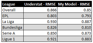
As discussed previously, expected points are a reflection of historical match outcomes based on xG difference on a match-by-match basis. Having scraped the data for the previous 5 seasons from understat, we leveraged R to model outcome probabilities based on xG figures from 2014–2018. Using these probabilities, we computed expected points for the ongoing 2018–19 season. The objective was to arrive at a model which could improve the expected points model provided on the understat website. For this, we computed the Root Mean Square Error (RMSE) from our model and compared it against that from the model on the understat website. After spending three days on this and trying 20+ iterations of different modeling techniques, here are the results comparing the performance of our best model with the understat model:

Since RMSE is a measure of error, lower values are better. As is obvious in image 4, our model performs better than that at understat with an overall RMSE improvement of 0.014. For some reason, my model for the Serie A doesn’t perform as well, though.
Of course, the difference isn’t that huge. Our model might be better because we may be using more recent data to build the model. Understat might have refreshed the model slightly earlier. It might also be that our model only appears better because we are testing it on just half a season of data. More data for testing might make it look worse. Lastly, we have just 2 digits after the decimal from the understat model. With such fine margins, the models might be closer if we take more exact figures from their model.
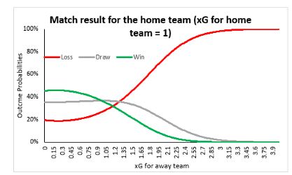
Nevertheless, the importance of xG is clear. We’ll leave you with a chart showing the variation in win/loss probabilities from our model. Notice how beautifully the model has captured home team advantage as well. Data science is amazing, isn’t it?

Image 5: Outcome probability variations
Originally published on Medium by Vibhor Agarwal –
Graduate Student, Sports Management at Columbia University


